Enhancing User Engagement Through Responsive Design
Responsive design has revolutionized the way websites and applications are built, offering a seamless user experience across various devices and screen sizes. One of the key benefits of responsive design is its ability to enhance user engagement. By adapting to different devices, responsive design ensures that users can easily access and interact with content, regardless of whether they are using a smartphone, tablet, or desktop computer.
One way in which responsive design enhances user engagement is by providing consistent and intuitive navigation. With a responsive website, users can easily find the information they need, without having to zoom in or struggle with non-optimized layouts. This streamlined navigation encourages users to explore the website further, increasing the likelihood of prolonged engagement and interactions.
Moreover, responsive design contributes to faster page loading times, which is crucial for keeping users engaged. With a responsive website, the content is optimized to load quickly on any device, preventing users from getting frustrated with slow loading times and abandoning the site. By providing a fast and smooth browsing experience, responsive design encourages users to stay on the website and interact with its content.
Furthermore, responsive design supports the integration of interactive elements, such as animations, sliders, and multimedia, in a way that enhances user experience on various devices. These interactive features can captivate users’ attention and encourage them to engage with the content, ultimately leading to a more immersive and enjoyable browsing experience.
In conclusion, responsive design plays a crucial role in enhancing user engagement by providing consistent navigation, faster loading times, and supporting interactive elements across different devices. Websites and applications that prioritize responsive design are better equipped to capture and retain user attention, ultimately leading to a more positive and engaging user experience.
A Guide to Optimizing User Experience with Responsive Design
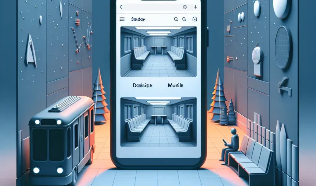
Responsive design has revolutionized the way users experience websites, offering an optimized viewing and interaction experience across a wide range of devices. When it comes to optimizing user experience with responsive design, there are several key considerations to keep in mind. One crucial aspect is ensuring that the content is displayed in a visually appealing and easy-to-read manner on all screen sizes, from large desktop monitors to small mobile screens. This involves thoughtful use of typography, imagery, and layout to maintain readability and engagement across devices.
Another important factor in optimizing user experience is the performance of the responsive website. Pages should load quickly and navigation should be smooth, regardless of the device being used. This requires efficient technical implementation and careful attention to the size and resolution of images and other media to minimize loading times.
Furthermore, the functionality of the website should remain consistent across different devices. Users expect seamless interaction with all features and elements, regardless of whether they are accessing the site from a smartphone, tablet, or desktop computer. This requires thorough testing and refinement to ensure that the responsive design adapts and functions flawlessly on various devices.
In conclusion, optimizing user experience with responsive design is essential for delivering a seamless and engaging experience to all visitors, regardless of the devices they use. By prioritizing visual appeal, performance, and functionality across different screen sizes, websites can truly maximize the impact of responsive design on user experience.
The Importance of Responsive Design in Improving User Interaction
Sure! Here’s a passage for your article:
Responsive design has become a crucial factor in improving user interaction on websites and digital platforms. With the increasing variety of devices and screen sizes, it’s essential to ensure that users have a seamless experience regardless of what device they are using. Responsive design plays a pivotal role in achieving this goal by adapting the layout and content of a website to fit the screen it’s being viewed on.
One of the key benefits of responsive design is its ability to enhance user engagement. When a website is responsive, users are more likely to stay longer on the site and interact with the content. This is because responsive design provides a consistent and optimized experience, reducing the need for unnecessary scrolling, zooming, or resizing. As a result, users can effortlessly navigate the site, access information, and engage with the features, leading to a more positive and satisfying interaction.
Furthermore, responsive design contributes to improved user satisfaction. When users can easily access and interact with a website on any device, they are more likely to have a positive perception of the brand or service. This positive experience can lead to higher conversion rates, increased customer loyalty, and positive word-of-mouth referrals. In essence, responsive design is instrumental in creating a favorable user experience that fosters lasting connections between the user and the digital platform.
In conclusion, the importance of responsive design in improving user interaction cannot be overstated. Its role in enhancing user engagement, satisfaction, and overall experience makes it a fundamental element in the success of any digital platform. As the digital landscape continues to evolve, implementing responsive design will be crucial in meeting the needs and expectations of users, ultimately driving positive outcomes for businesses and organizations.