Understanding User Behavior and Needs
Understanding user behavior and needs is a critical aspect of designing a responsive user interface. By gaining insights into how users interact with a website or application, designers can make informed decisions that enhance the overall user experience. Here are five tips for incorporating user behavior and needs into the design process:
1. Conduct User Research: Begin by conducting thorough user research to gather data on how your target audience engages with similar interfaces. This can involve surveys, interviews, and analytics to understand their preferences, pain points, and behavior patterns.
2. Create User Personas: Develop detailed user personas based on the research findings. These personas represent fictional characters that embody the characteristics and behaviors of your target users. By understanding the motivations and needs of these personas, you can tailor the interface to cater to their specific requirements.
3. Utilize User-Centered Design Principles: Implement user-centered design principles to ensure that the interface is intuitive and easy to navigate. This involves organizing content based on user priorities, providing clear navigation pathways, and optimizing for accessibility across different devices.
4. Leverage A/B Testing: Use A/B testing to compare different interface designs and gather insights on how users respond to each variation. This data-driven approach allows you to make design decisions based on real user behavior, ultimately leading to a more effective and responsive interface.
5. Seek Continuous Feedback: Encourage feedback from users throughout the design process and even after the interface is launched. This ongoing feedback loop provides valuable insights into how well the interface is meeting user needs and allows for iterative improvements based on user behavior.
By incorporating user behavior and needs into the design process, designers can create a responsive user interface that resonates with the target audience and delivers a seamless user experience.
Importance of Consistent Design Elements
Consistent design elements play a crucial role in creating a responsive user interface that enhances user experience. When designing a user interface, it is important to maintain consistency across all elements such as colors, typography, spacing, and layout. Consistency in design establishes a visual harmony that makes the interface more predictable and easier to use, which ultimately leads to higher user satisfaction.
Firstly, having a consistent color scheme helps in creating a unified look and feel across the interface. Using a well-defined color palette and sticking to it throughout the design ensures that users can easily associate certain colors with specific actions or elements, thereby improving usability.
Secondly, maintaining consistent typography throughout the interface is essential for creating visual hierarchy and improving readability. Using a limited set of typefaces, font sizes, and styles ensures that users can quickly recognize different types of content and navigate the interface with ease.
Thirdly, consistent spacing and layout help in organizing the interface in a way that is visually appealing and easy to comprehend. By maintaining uniform spacing between elements and keeping the layout consistent, designers can provide a sense of order and structure, making the interface more intuitive to use.
Furthermore, consistency in the placement of interactive elements such as buttons, forms, and navigation bars across different screens or devices ensures that users can predict where to find specific functionalities, reducing cognitive load and learning curve.
Finally, maintaining a consistent design language across different devices and screen sizes is important for creating a seamless user experience. Whether the interface is accessed on a desktop, tablet, or mobile device, consistent design elements contribute to a cohesive and user-friendly experience.
In conclusion, consistent design elements are integral to creating a responsive user interface that prioritizes user experience. By ensuring consistency in colors, typography, spacing, layout, and interactive elements, designers can enhance the usability and visual appeal of the interface, ultimately leading to higher user satisfaction and engagement.
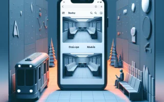
Optimizing UI for Different Devices
When designing a responsive user interface, one of the key aspects to consider is optimizing the UI for different devices. With the multitude of devices available today, such as smartphones, tablets, laptops, and desktops, it is crucial to ensure that the user interface provides an optimal viewing and interaction experience across all of them. Here are 5 tips to help optimize your UI for different devices:
- Flexible Layouts: Design your UI with fluid grids and flexible images to ensure that the layout adapts to different screen sizes and resolutions. This helps in maintaining the visual hierarchy and usability across devices.
- Scalable Typography: Use relative units like percentages or ems for fonts to allow them to scale according to the device’s screen size. This ensures that text remains readable and visually appealing on all devices.
- Media Queries: Implement media queries in your CSS to apply different styles based on the device’s characteristics such as width, height, resolution, and orientation. This allows for targeted customization of the UI for various devices.
- Touch-Friendly Design: Ensure that interactive elements such as buttons and links are easily tappable on touch devices. Use ample spacing and consider the size of the user’s finger to provide a seamless touch experience.
- Performance Optimization: Optimize images and other media assets to ensure fast loading times on all devices. Minimize the use of large files and leverage techniques like lazy loading to enhance the performance of the UI across different devices and network conditions.
By implementing these tips, you can create a responsive user interface that delivers a consistent and optimized experience across a diverse range of devices, ultimately improving user satisfaction and engagement.